Infographics are not new. Think back to your school days and you will remember being taught how to make pie charts or bar graphs to represent data more visually.
This was always the case for numerical data – maths offers all manner of graphical solutions to help us number-crunch large numbers.
But for data that is almost completely word-based, the old graphical solutions did not offer a better way of simplifying the information. And that is where the humble Wordle comes into its own…
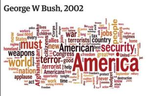
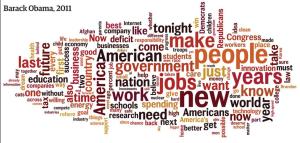
Wordles are simple diagrams, showing the key words is a speech or document. The size of each word is relative to how many times it appears in the document, thus giving an indication of how much weight is truly given to that issue.
The wordle below is from the Labour 2010 Election Manifesto. Words such as: ‘people’, ‘support’, ‘ensure’, ‘help’, ‘public’ and ‘local’ clearly show that Labour felt the government’s job was to provide help to people during the recession of last year, with less focus on reducing the deficit.
This wordle comes from George Osbourne’s Comprehensive Spending review of October 2011. The focus on words such as ‘economy’, ‘tax’, ‘business’ and ‘lower [the deficit]’ show the priorities of the Conservative government at the time.
Moving onto American politics, it is useful to compare and contrast wordles for State of the Union addresses by Barack Obama and George Bush. While Bush’s wordle below is quite jingoistic – focusing on words such as ‘America’, ‘American’, ‘security’, ‘world’, ‘terror’ and ‘Amercians’, Obama’s is more focused on bread and butter issues. His top words are: ‘people’, ‘jobs’, ‘new’, ‘work’, ‘government’ and ‘years’
.
Perhaps revealing about American politics, and politics as a whole, is that even Obama’s address, moving away from Bush’s war-rhethoric, invokes nationalistic sentiment to drive home the message – ‘America’ and ‘American’ are also big words in this speech.
In short, the wordle provides an excellent way of visually digesting large amounts of non-numerical data in a way that clearly communicates and reveals the priorities and ambitions of leaders and governments.


Pingback: Budget 2011 as a Wordle | Infographics For Dummies